
This article illustrates how Doug Matheson built a magnificent passenger station for his Northland Railway using JigStones.
Planning
Normally when I build a structure, I look first at the space it is to occupy. Then I use a freelance design based on a prototype that appeals to me. The space for the station is elevated, about 24 inches above ground and will sit against a storage shed (for a 1:1 tractors and stuff). It is in a moderately sheltered spot and while protection from the weather will be necessary, it won’t be submerged in water. The space is long, up to about 8 feet or more if I need it but from the perspective of maintenance, not very wide. Assuming at least two tracks in front of the station and a bit of space in front of that, the station cannot occupy more than 20-24 inches in width if my short arms are to reach.
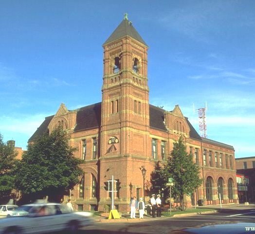
With the space settled, I looked at the prototype. A building I have long admired is the city hall in Charlottetown, Prince Edward Island. The city hall, constructed of brick in the Romanesque Revival style popular in the 1880’s, survived a number of civic calamities over the years and is today a national historic site. It was designed by the noted architect Charles Chappell who also designed many well-known Maritime railroad stations including the one in Kensington PEI, home of Anne of Green Gables. Many of Chappell’s public buildings have a similar air and I think you can see the resemblance to a railroad station in the picture.
For my freelance version, a number of changes are necessary both to make it a railway station and to fit my space – not to mention make it practical for an unskilled modeler like me to actually build.
First, the real building is almost square, a bit over 90 feet on each side, plus has an addition that is roughly 80 by 40. This is really big in 1:20th scale. I removed the addition to restore the appearance to its original as Chappell intended. I am reluctant to compress it further as it will lose the character inherent in its proportions. Next, given the narrow space, I decided to model only a portion of the depth. I selected a depth of about 20 scale feet and altered the roofline a bit to make the structure appear rectangular as opposed to square.
While I am not a draftsman, I usually sketch up a freelanced building to check on proportions and views. Some modelers use mockups, I have always used drawings but no matter how it is done, I think it is essential. My drawings of this structure revealed some possibilities with rooflines but also suggested that anything shorter than the 90 feet of the original would not look good and that the three arched areas were essential to capture the character of the prototype.
Next, all that fancy brickwork, while giving much of the charm of the original building, is likely beyond my capability. Voila! I changed the building to a stone structure. Although vastly simplified, it certainly had its own building challenges. For architectural interest, the arches over the windows and doors are retained as well as the tower. In fact, the tower will sport clocks to embellish its facade.
The rooflines were problematic. My own preference is for a copper roof and in theory that should not be too hard. But the building can easily develop into a huge monolith if the roof is steeply pitched and “solid”. Often the expanse of a large roof was broken by dormers. In this case, however, the Romanesque interpretation was a cornice peak centered over the middle arch with a false front. Chappell used this to impart a certain character and the sketches revealed that it was absolutely essential to retain this feature in some form.
I have given a lot of detail here on the design thinking I went through to illustrate the approach. Like I said, some modelers work best from mockups and others of us prefer to sketch. Some will use a CAD program to design on the computer in a fraction of the time. Likely the thinking/imagineering process takes the same time no matter which approach is used. The historian in me finds this to be an essential and enjoyable part of the construction of any building.
Constructing the Basic Building with JigStones
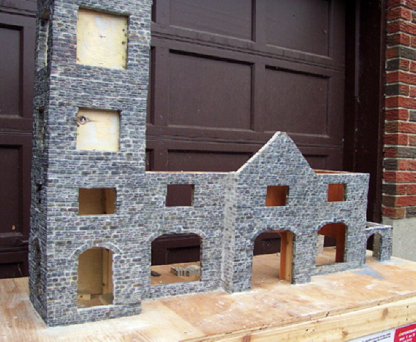
In terms of construction, I set aside the obvious problems of how to model the ornate cornices, the doors and windows and focused on the basic structure. A discussion with Linda Spencer at JigStones confirmed my fears that this was a fairly large structure to build without additional support. Although JigStones are normally built by just gluing the castings together, that high tower (55 feet of brickwork in the prototype – 33 inches of stone in the model) gives pause for reflection on its likely stability. Accordingly, it was decided that a plywood substructure would be built and then sheathed with JigStones.
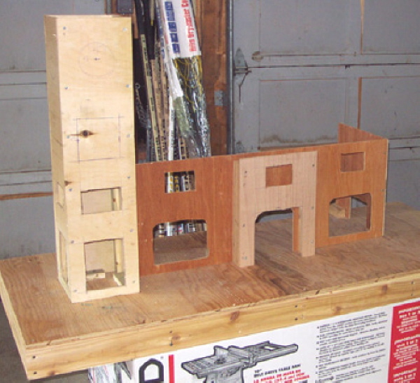
The substructure was constructed using quarter inch plywood cut on my table saw. After cutting out the rough openings for the windows and doors, the substructure was assembled on a cedar and plywood base. In the following picture, the beginnings of a few changes I made to the architecture to convert a city hall to a station are noticeable. First, the tower which would house the station agent is more pronounced to give a better view of the tracks. Second, out of sight just behind the tower is the baggage and express handling area. And on the far right of the station, space has been left for a porte-cochere for arriving and departing passengers.
JigStones are designed to be set up without a framework, but for this structure an underlying frame of plywood was thought to be essential. Having constructed the plywood frame, I think I would use that approach for any size of building with JigStones except perhaps the very smallest. Having a frame makes for very square corners and straight walls without fussing continuously with a level and square. It also allows the placement of background markings and lines to help keep courses of stone horizontal with moderately even mortar lines. I know it sounds like a minor detail but once the gluing of stones starts, my concentration on say square corners is not usually too high.
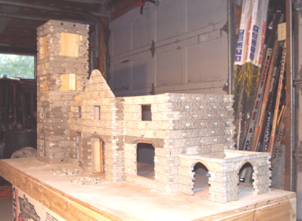
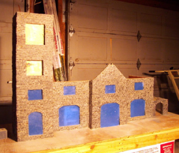
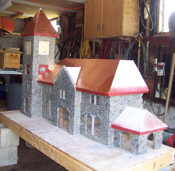
Some considerable time elapsed before the JigStones were cast and glued to the plywood frame. At this point, the station appeared as shown in the following picture.
 The grout application is straightforward. I used Mapei Ker 200 (polymer modified Portland cement sanded) in warm gray. It is a grout intended for tile or terrazzo and is suitable for exterior use.
After mixing it to the normal consistency, it was applied with a sponge working it into all the mortar lines, glue joints and across the face of all the stones as well. Then the stones were sponged with clean water to thoroughly wash off the excess grout. The sponging was actually done about 3 or 4 times to remove as much of the residue as possible. The stones started to blend in colour and the mortar lines stood out.
Painting the JigStones
My goal was to produce a limestone façade with a faint buff hue. The red stones so prevalent in the southwest USA are not common at all in this locale. Accordingly, I picked up some tubes of artist’s acrylics loading up on buff in a few different hues, a burnt umber, a bit of charcoal (which I suspect goes a long way), a dull pale olive green and mixing white.
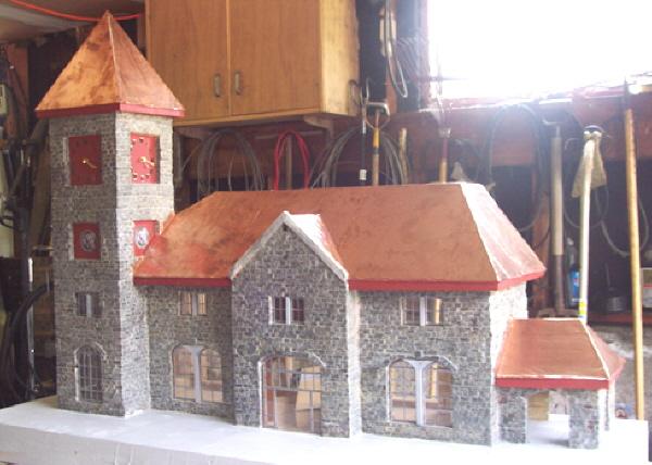
The earlier picture of the JigStones clad station emphasized the differences in colour of the various batches of JigStones, so I tried a slate gray wash to unify the colours without making everything a solid gray. I used a very thin acrylic wash almost dry brushed across the faces of the stone to keep it out of the mortar lines
Some of the really dark stones now looked fine to me but many stones were still too light. More importantly, to my eye the stonework lacked “life”, as it was too flat and a bit uniform in colour. Some further dry brushing was required. I am not an artist, so even mixing colours to get the right shade is quite difficult for me. On a palette of scrap plywood, a small amount of paint from each tube was squeezed out in parallel “ribbons”. I then proceeded to experiment.
The first couple of walls tried were in the back and not too visible. They were most unsatisfactory. I could not seem to get the right shades, had trouble with the dry brush technique, and the acrylic paint tended to run into the mortar lines. It took some time until I finally got control of the brush and was able to get the colours right and the paint on the stone where I wanted it. Ultimately, the third wall was better:
The technique that worked best for me was essentially my adaptation of that described by many other Jigstoners. On the palette were placed a ribbon of each colour: white, charcoal, buff, sienna, and a very small dab of red oxide and dark blue. I mixed the colours on the palette with my brush and then carefully painted individual stones avoiding the mortar lines. I did not paint all the stones, perhaps about 25% of them in all in different colours aiming essentially for a buff-yellow brown colour. Then I went back and dry brushed all the stones in a light cover of slate gray made by mixing buff with charcoal. This dry brushing is not opaque and allows some of the colour underneath to show through. At the same time it unifies the wall and highlights the rough stone texture of the JigStones.
The following picture of the completed painting clearly shows the stone against the mortar lines. It also tends to emphasize the slate gray colour that matches the limestone in this area.
I guess the most important lesson is … experience starts when you begin … so grab the acrylic paint and brush and have at it!
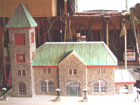
 For a sense of size, the stone walls of the station are 57 inches long overall, and 15 inches high while the clock tower is 34 inches high. The porte-cochere is on the right hand end roughly balancing the clock tower to the left.
Windows
The second floor windows are all the same size, 80 inches by 46 inches. Eighty inches is quite wide without any support in a building built from stone and real windows would need to open for ventilation. After a long look at many buildings around Ottawa, I decided to use casement windows, as opposed to double hung windows, as they were more common in public edifices. The final sketch showed a pair of casements 35 inches wide by 45 inches high flanking a 10-inch wide cast concrete support column.
For the windows in the first floor of the clock tower, I divided the opening, which is 140 inches high by 80 inches wide into three distinct areas. At the top in the arch, I sketched in a fan shaped transom window. Here no additional support is presumed needed as the arch provides the structural strength. Under it I placed a pair of casements, 36 inches wide by 76 inches high with steel frames filling out the opening. On the bottom, a window 80inches wide by 30 inches high tilts open at the bottom. Of course in the model there will not be any windows left open, as making this weather tight is a prime consideration.
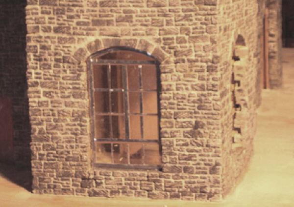
The first step was to cut and file 1/8 of an inch Plexiglas sheet to the shape of each window. The Plexiglas panes were left in their blue plastic protective wrap for this step, giving the station a rather strange appearance.
The Romanesque Revival style windows were laid out on the Plexiglas using a sharpie and then lead glaziers tape was applied to represent the steel frames. The first window press fitted into place looking like this.
Building a Copper Roof
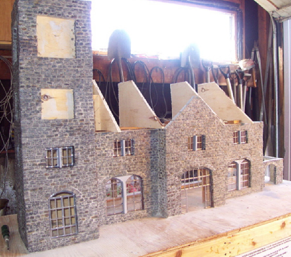
I calculated the roof geometry, especially the valley that goes to the corner of the clock tower. Then I framed it in plywood formers. Here is how it looked after the framing.
The plan had been to glue the thin copper foil to 1/4-inch plywood for the roof until I saw a picture posted on a large scale forum of a water-damaged model building. Water is evil when it is gets on wood! Instead, I decided to sheath the top of the plywood with styrene before adding the copper foil. I sealed the styrene completely using Bondo auto body filler. Should any water penetrate under the foil (I do not trust a .005 of an inch piece of foil to be completely weather proof under snow) at least it will not cause the plywood to delaminate or fail.
I worked slowly applying the 1/4 of an inch plywood sub-roof. My pace would have been faster, if I did not have to cut every piece twice! But figuring all the bevels and angles was a lot of mental masturbation, and very error prone too.
To determine the position of the framing for the roof over the main doors, I used a laser level, tripod mounted. The bevel angles on the hipped roof joints are 90 degrees minus 1/2 the angle of pitch. But even knowing this did not save cutting each piece at least twice!
I completed the soffits and fascia, then commenced installing the copper foil. Here’s a view from the porte-cochere end. In this view you can see my copper flashing against the clock tower. I do not think I would ever be a good roofer!
As this was my first time working with foil, I doubt I could teach anyone the correct or best process, but you might learn a few things not to do! One thing I learned right away, copper foil has VERY sharp edges.
I laid out each piece to be cut on a large flat steel table using a pen and a square. The copper accepted the pen marks readily and a light touch did not score the material. Cutting is probably best done some other way than with a pair of sharp scissors. They cut through the foil easily, but I had a lot of trouble cutting straight and accurately. More importantly, the foil creases extraordinarily easily if not kept flat all the time.
Lots of trial fitting was required for all the valleys and odd shapes on this roof. Strakes had to be added every 3 inches to simulate the copper “bonding boards” between rolls of 5 foot wide copper sheet. Care had to be taken to ensure that any joints between the foil pieces fell on the multiples of 3 inches so that they would be hidden.
Once cut accurately (??!!) to fit, the back of the foil was sprayed with 3M Super 77 and glued in place. The glue holds the foil well enough to avoid clamping, which is a good thing as there are very few places on a roof like this for clamps. A big oven mitt helped smooth the foil and removes any air bubbles or small, unseated wrinkles. If the foil wrinkles fully, the crease does not ever come out. So care must be taken. The oven mitt also helps keep greasy fingerprints off the surface of the foil which will be a big help when it comes to applying the finishes to it. As an additional benefit, the mitt saves the fingertips from nasty cuts!
I found a friend who has access to an accurate shear. He cut a copper sheet into 0.2-inch wide strips. These strips were used to simulate the strakes.
In the end, I think the copper foil was worth the trouble, although I said some choice words while working on it! The alternative of using a styrene to represent a copper roof puts the full burden on the painted finish. My artist friends and a quite a few other modelers pointed out that a painted finish in a foreground model would not look like the green patina on real copper.
Finishing Details
I visited Lee valley Tools, their headquarters and main showroom are in Ottawa. It is always fun to look at their very fine antique tool collection, but I digress. Clocks were the intent of my visit and I did pick up the movements, hands and Roman numerals for the four faces in the clock tower.
I also started the task of simulating a concrete platform around the station. My plan was to apply two coats of exterior, flat gray paint and then to weather. The concrete lines were to be drawn in with a sharpie. Since the base is made of plywood, the first step was to fill the rather ugly plywood grain as well as any surface cracks, defects or screw holes. A high quality spackling compound is just the ticket for this. Here is a picture after the application of the spackling compound using a drywall trowel I am only a marginally better at dry walling than roofing!
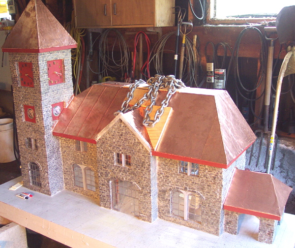
After a break to work on clocks, I recharged my enthusiasm for working with metal! The strakes were cut on a shear to a very precise measurement. Unfortunately a shear is like a giant paper cutter and introduces a curl in the metal. Each strake had to be straightened before being applied, a tedious task. A torch was used to heat the copper slightly and then the twist came out relatively easily. The straightened pieces are then cut to dimension I tried using a Dremel tool but soon resorted to the good old-fashioned hack saw. The strakes were applied with JB Weld.
Clamping for the JB Weld to set up was awkward due to the shape of the roof. My very high tech clamping arrangement consisted mainly of a heavy chain that was draped over the strakes as they were set in place. I used a variety of pieces of plywood and other makeshift “stuff” to hold the strakes in place a few pieces at a time while the JB Weld set up for 24 hours. The picture shows a typical bunch of strakes as they were “welded”.
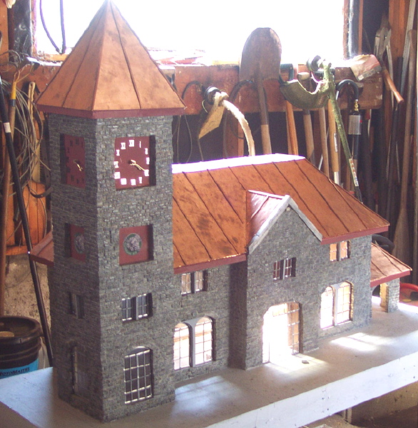
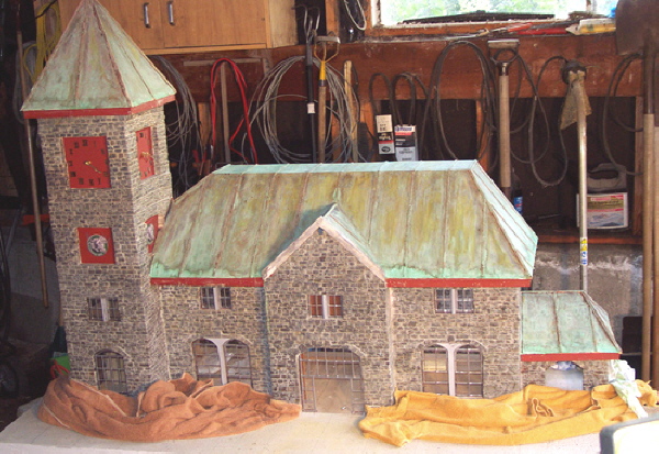
Here is a picture of the station with the copper roof finished. That copper roof really is dazzling in the sun.
Getting the Green Patina on the Roof
I was nervous as the application of this very watery substance, Patina Green from the art firm Innovative Finishes, as it did not do anything immediately. The instructions said to wait 24 hours, but after just a few minutes it started to tarnish the copper. If it did not work out, there was no going back now.
After the patina green finish was applied to the copper, the result was not good! In fact, it came out very streaked. The picture below makes it look even worse in the dim light although it is not unlike copper roofs that have started to acquire a patina but have not fully achieved it. The foil was streaked with greens and black, while the strakes had hardly any colour. My artist friends said to apply another coat!!
After several coats, the patina green finally came along. It was still not quite as green as I would like, but it was much better. One more coat of patina green was applied and then time was left to do the rest.
I have been observing copper roofed buildings and have noted that any that are truly uniform are fake! The real old copper roofs all have some streaks, although not as “streaky” as my roof still is. Although the roof is not perfectly even in colour, I am breathing a little easier. For a while I had visions that I wrecked the whole thing with this process.
Finishing the Station
Platform lighting has been installed. These are Victorian street lamps from a Christmas Village with JigStones bases added to make the height closer to scale. The front doors were made with stained pieces of 1/16 of an inch pine. A rudimentary interior was added.
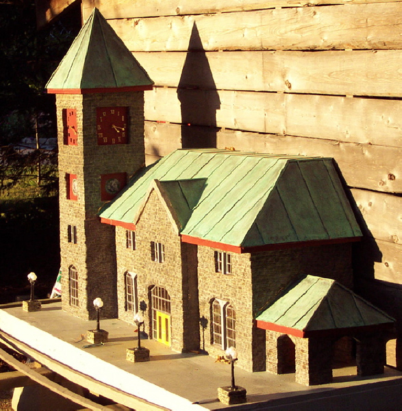
A picture of the station installed in its outdoor location, although no tracks have been laid there yet.
1 comment
Brilliant work Doug. Congratulations on making a fine building model.
Cheers from a (very) southern cousin. (Tasmania).